Agent Builder
Turning a developer playground into a no-code app for building agents that reply with UI.
Ask about this project — or anything Rahul's built.
Agent Builder lets anyone build and deploy AI agents, without code.
Agents answer with UI: dashboards, charts, cards you can actually use.
I redesigned a developer testing console into a full product. It's in production.
161 orgs publishing agents became 2,867. Median time to a first agent: under a minute.
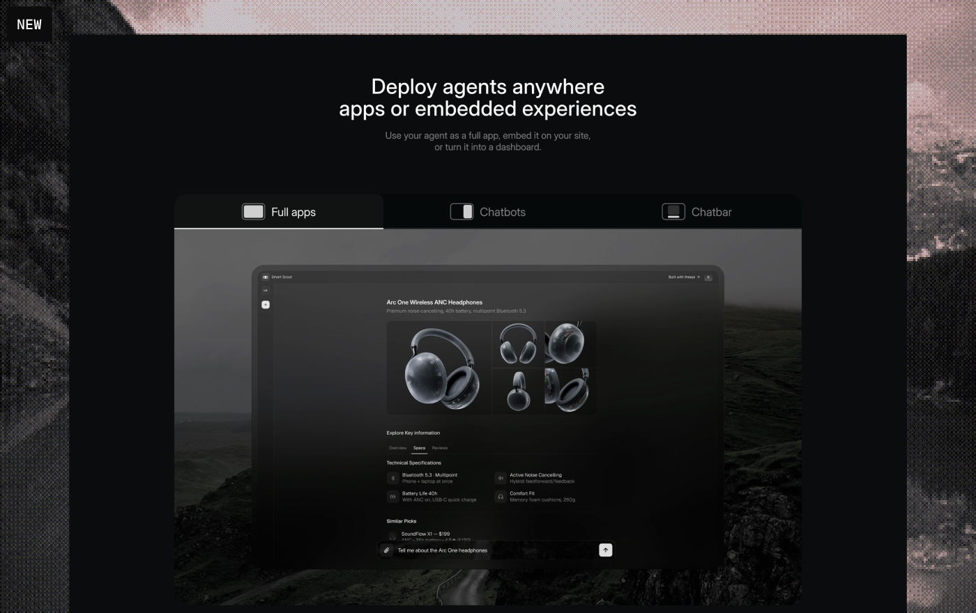
Agent Builder is a no-code tool for building AI agents. You connect your data, apps, files, even websites, and you get an agent that works on top of it. When it's ready, you publish it as a standalone app, share it with a link, or embed it in your own product.
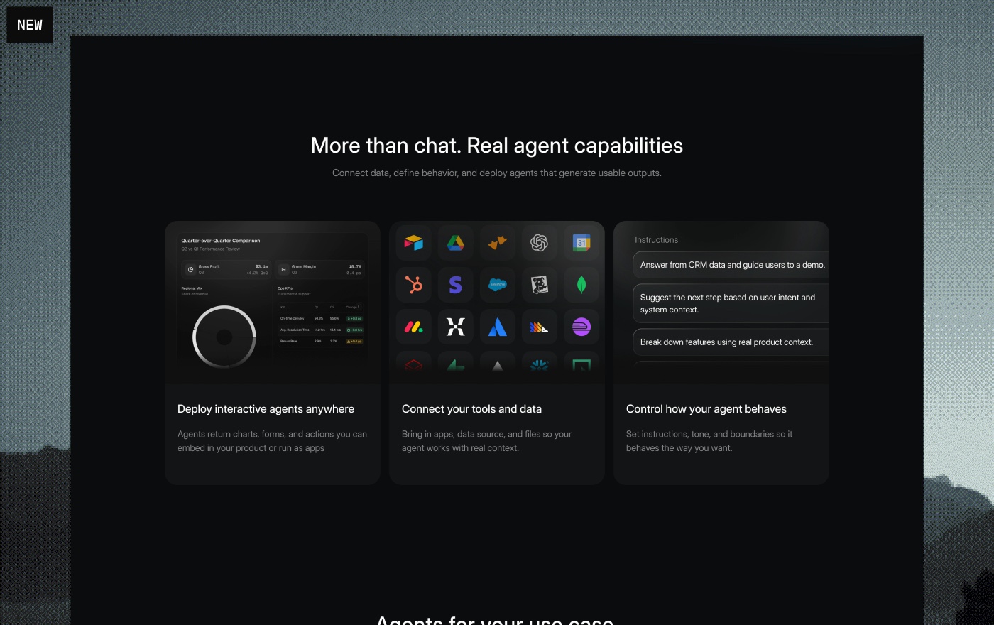
What makes it different is the output. Most agents reply with paragraphs. These reply with real interface: charts, tables, dashboards. That made it a strong fit for data and analytics: connect your MotherDuck or Postgres data, talk to it in plain language, and get back dashboards you can actually draw insights from. Because the agents render charts in real time, working with data stopped being a wall of text and became something you read at a glance.
Agent Builder grew out of the OpenUI Cloud console, where developers tested the API. I turned it into something anyone can use. I designed the flows and built the front end of several of them with AI. It's in production.
Onboarding
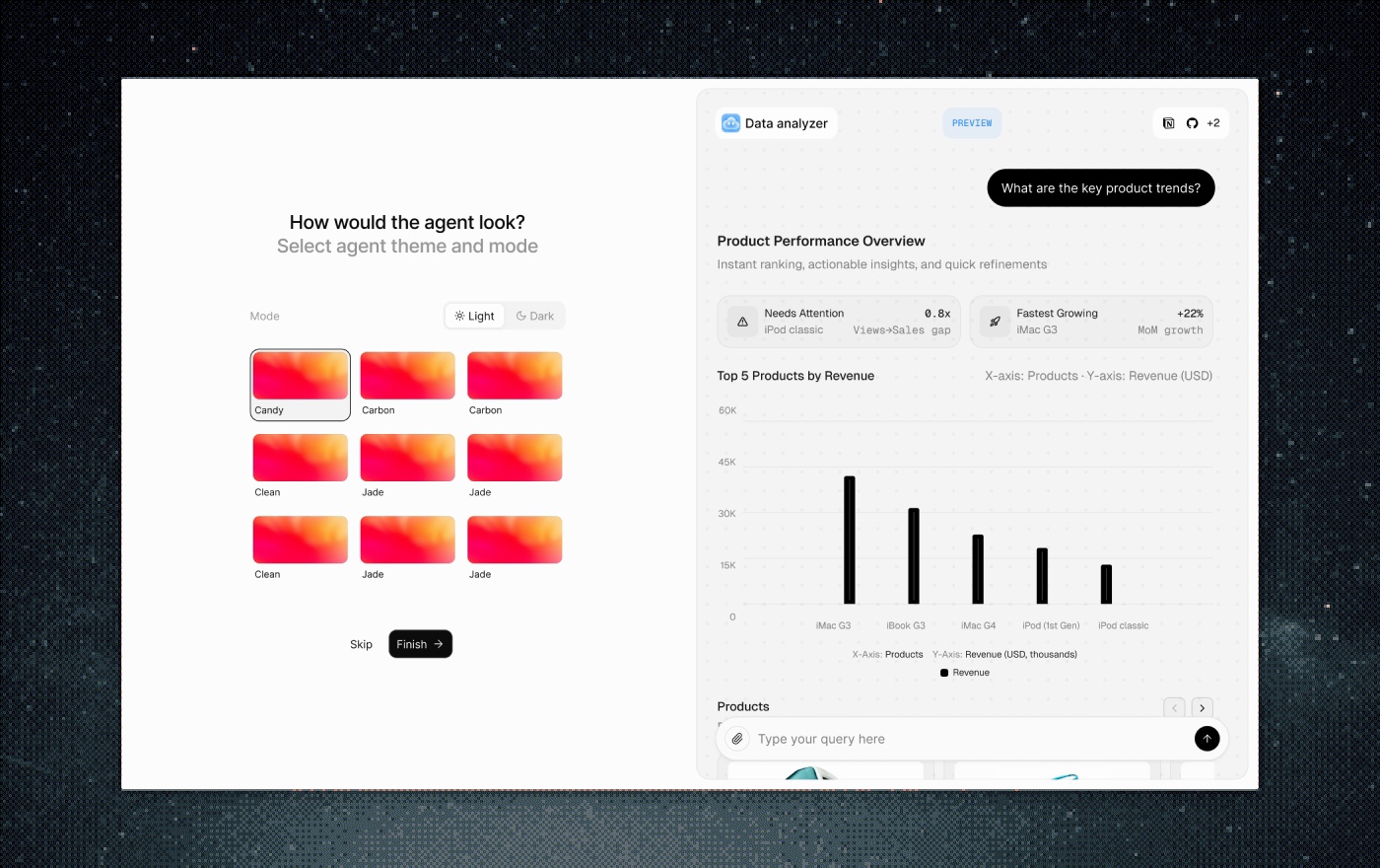
Onboarding was rebuilt three times.
The first was ordinary: you picked the kind of agent you wanted to build. Too basic, and conversion was low.
So we built a second: a page where you describe your agent and we do most of the setup for you. That lifted conversion. But a new problem showed up: people finished onboarding and didn't come back. Stickiness and retention stayed low, because they'd built something without understanding what it was.
That pointed at the real goal. Onboarding isn't about pushing the user into the product as fast as possible, and it isn't about conversion. It's about giving them value, and setting things up so the product makes sense to them.
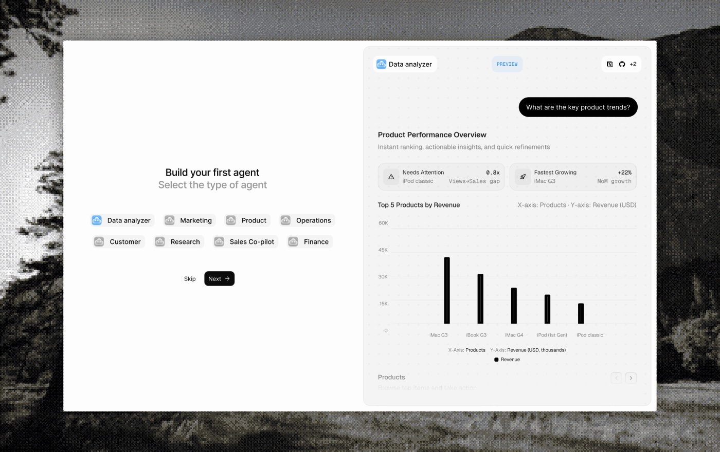
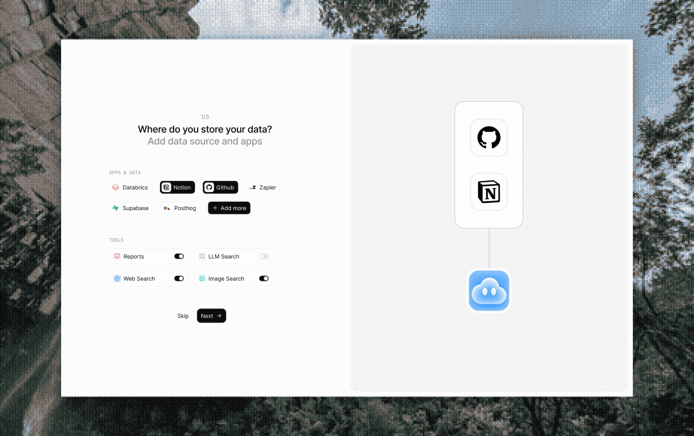
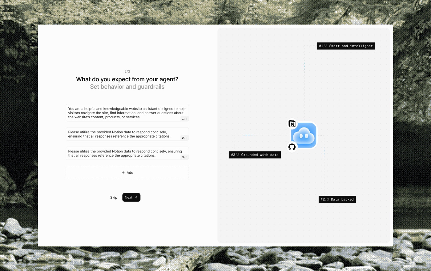
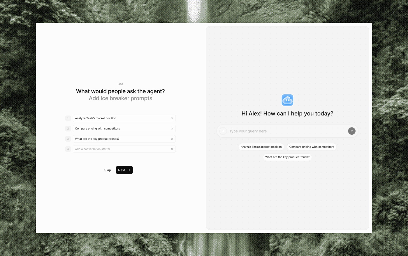
So we built a third, and made it experiential, with controlled friction on purpose. A few points of resistance, placed where they make a user slow down and fall for the product instead of rushing past it:
- Pick your product.
- Pick a category, and watch a live agent preview build on the right. This is your agent. This is what it'll look like.
- Then a few light screens that quietly show how data and tools connect, without calling it configuration.
You understand what you're making before we ask you to make it.
The data on this version isn't in yet. The bet: conversion dips a little while retention and stickiness go up. That's the trade we wanted.
Configure panel
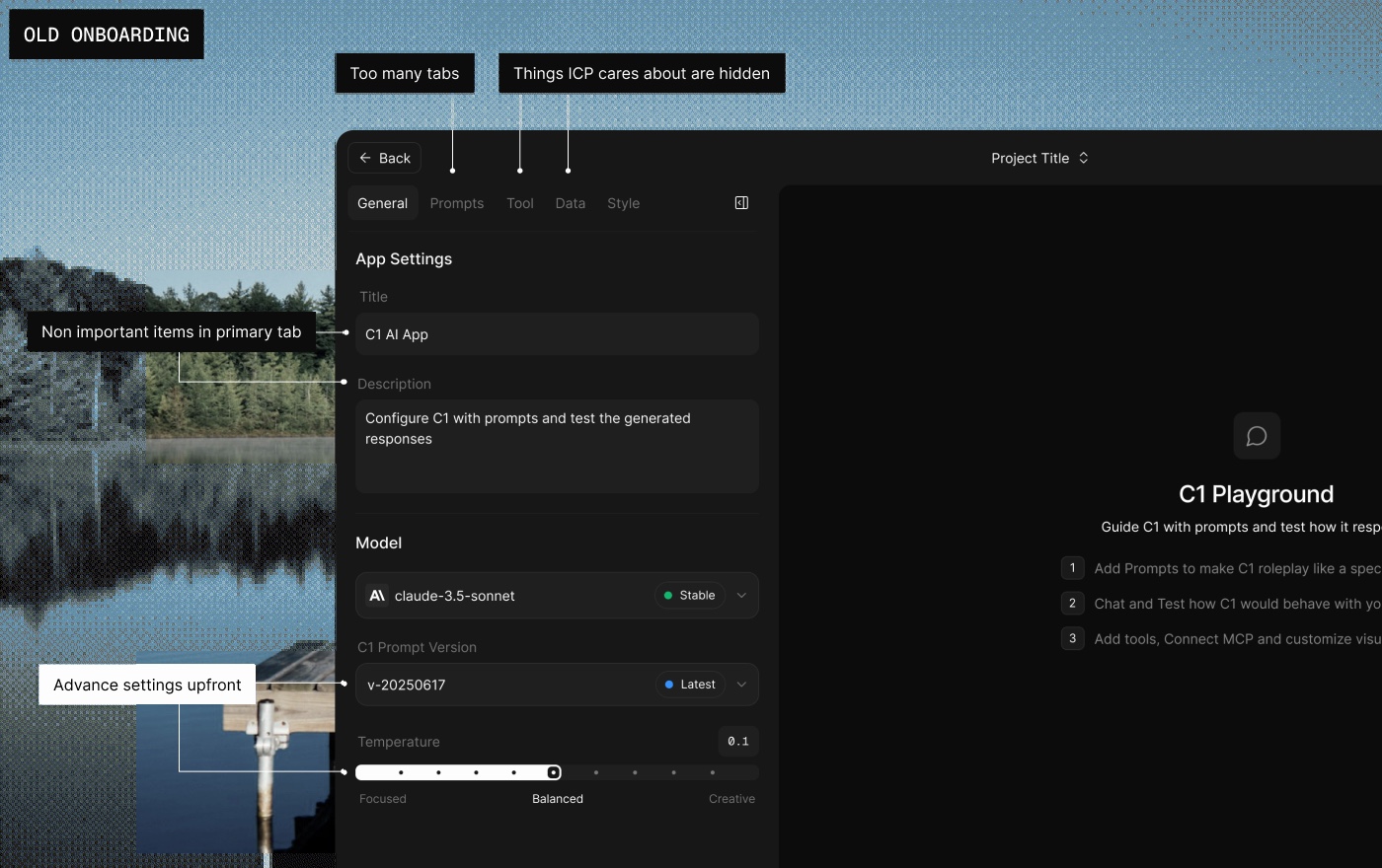
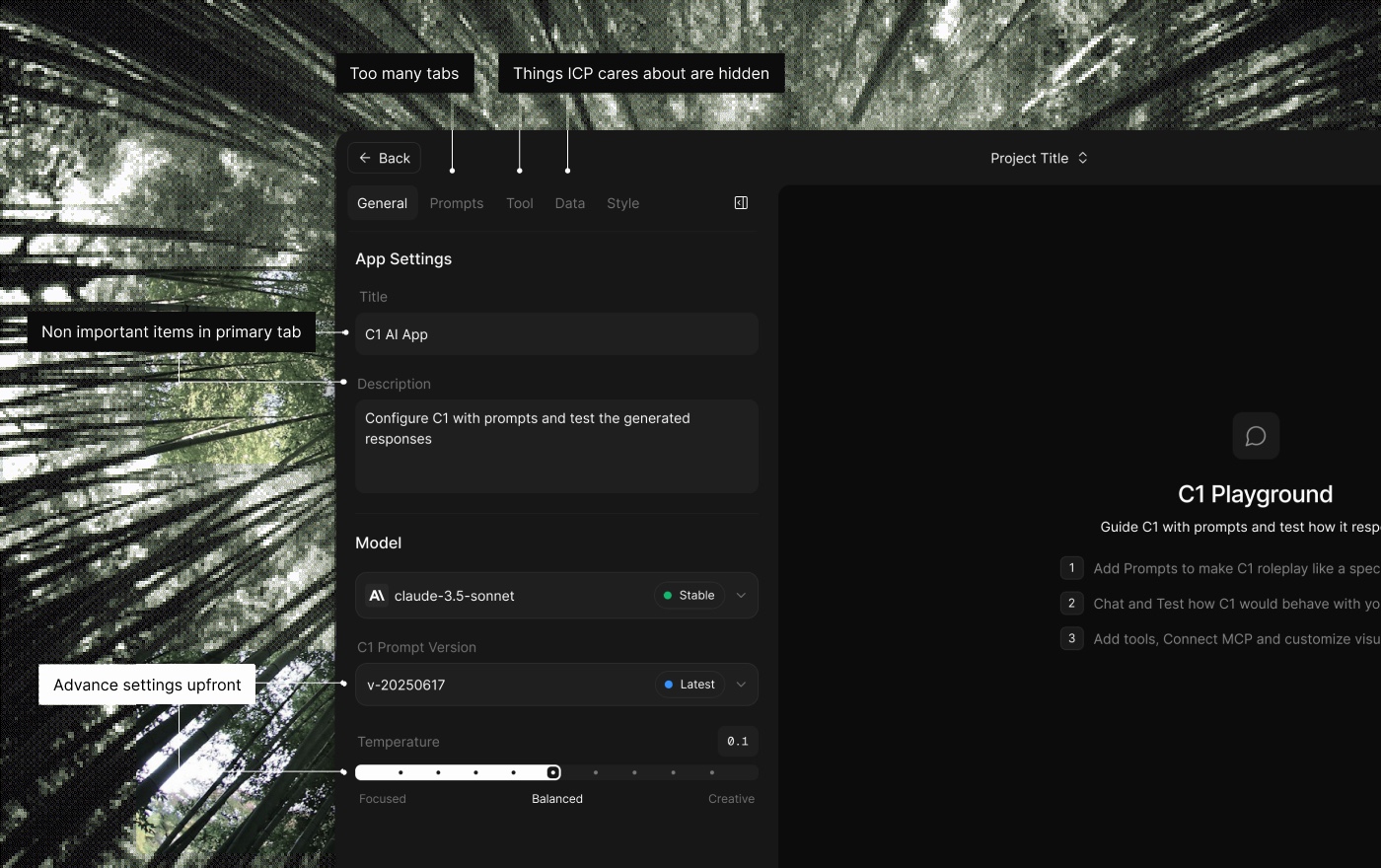
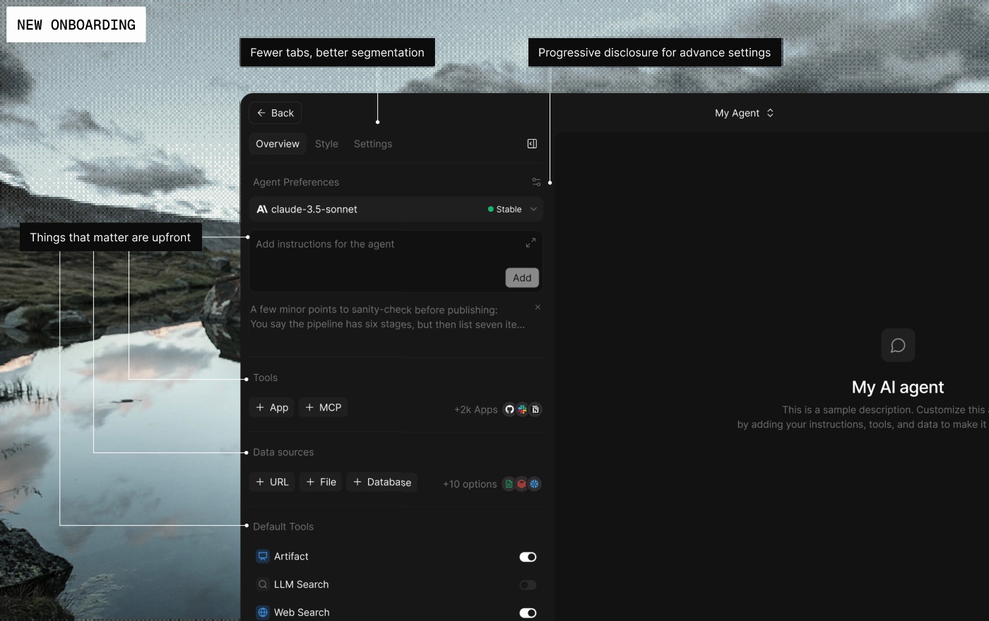
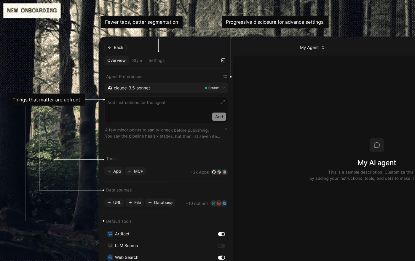
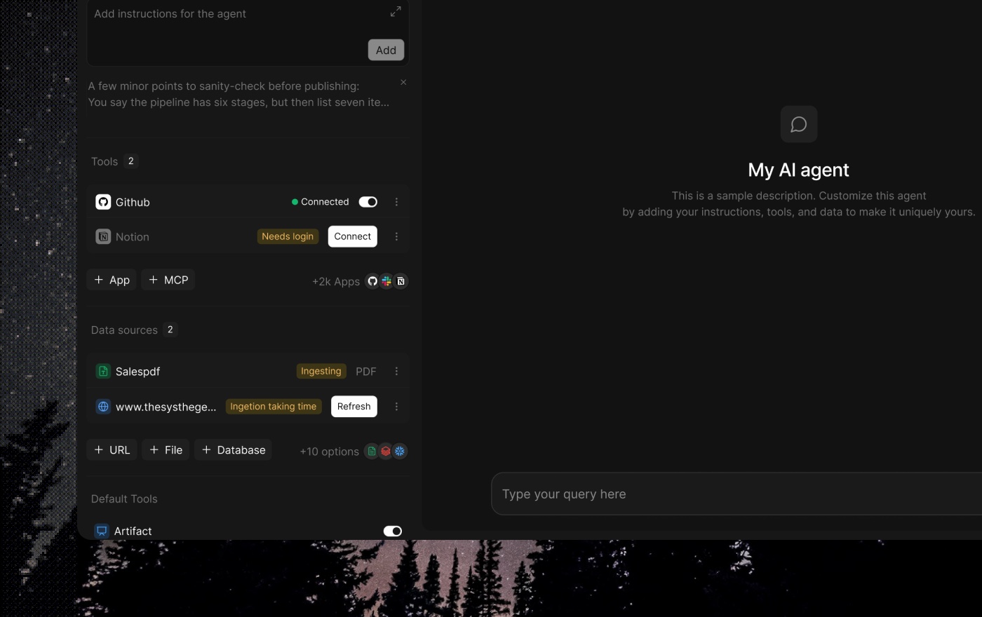
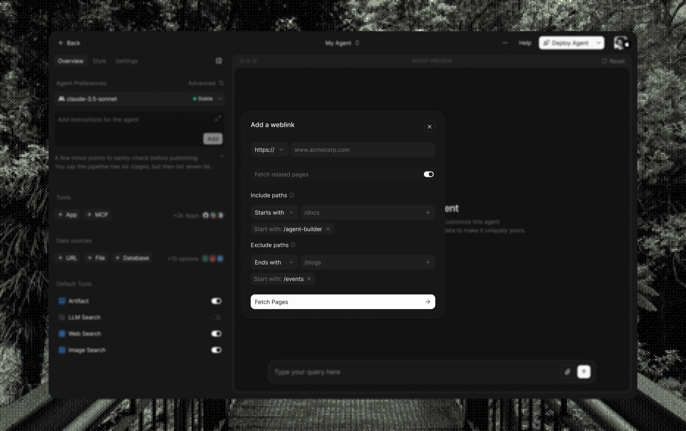
One panel sets up the whole agent: data sources, tools, apps, MCP, system prompt, theming, and settings.
The old version put rare options at the front, things real users never touched. I reorganized it so the things that matter sit up top: data, tools, and apps. Everything else moved out of the way.
The depth is still there when you need it. With MCP auth, for example, you can choose whether the agent uses your credentials or your user's. Simple by default, deep when you ask for it.
Deploy
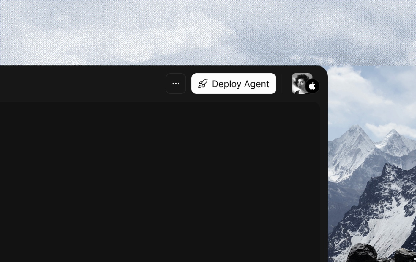
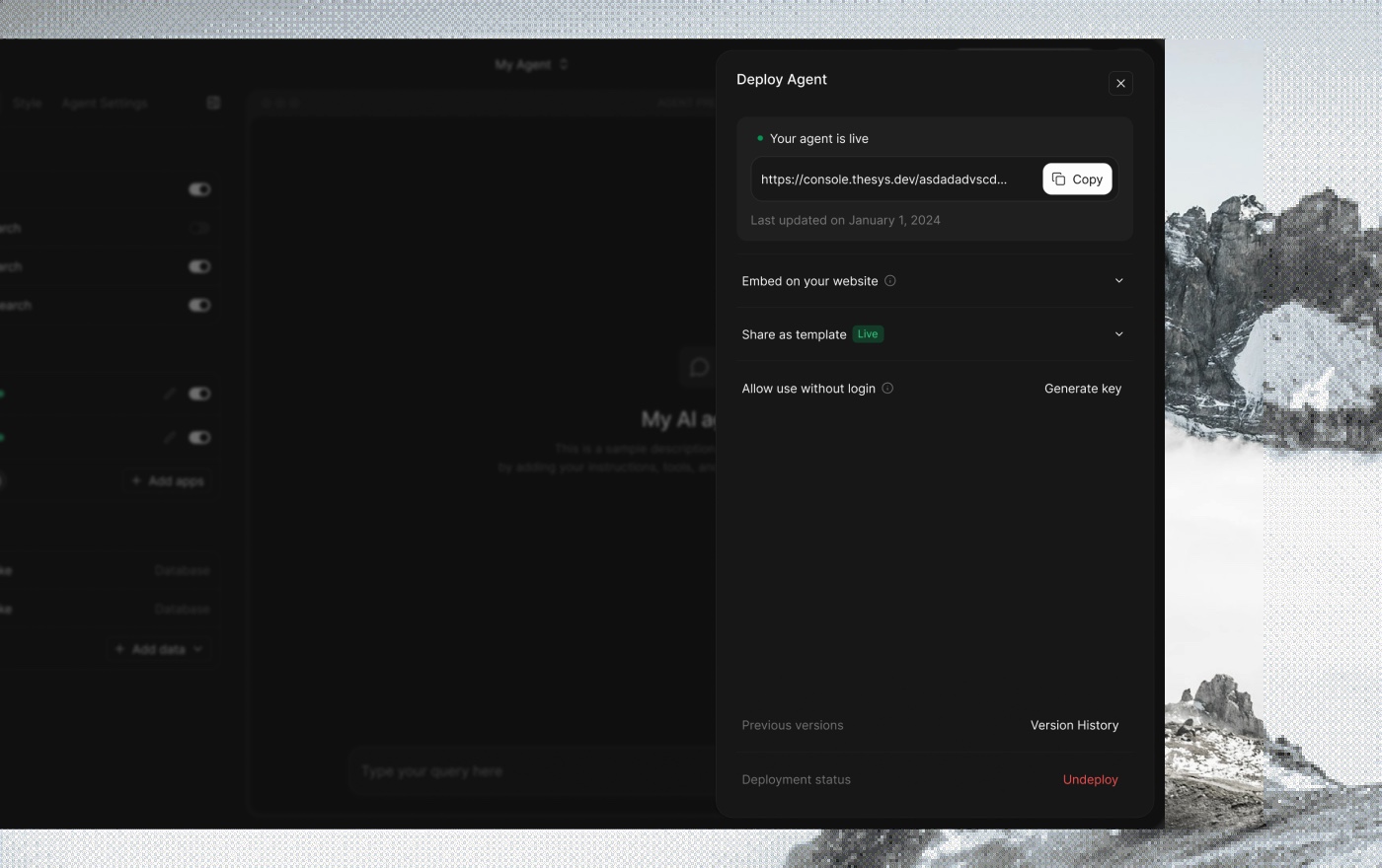
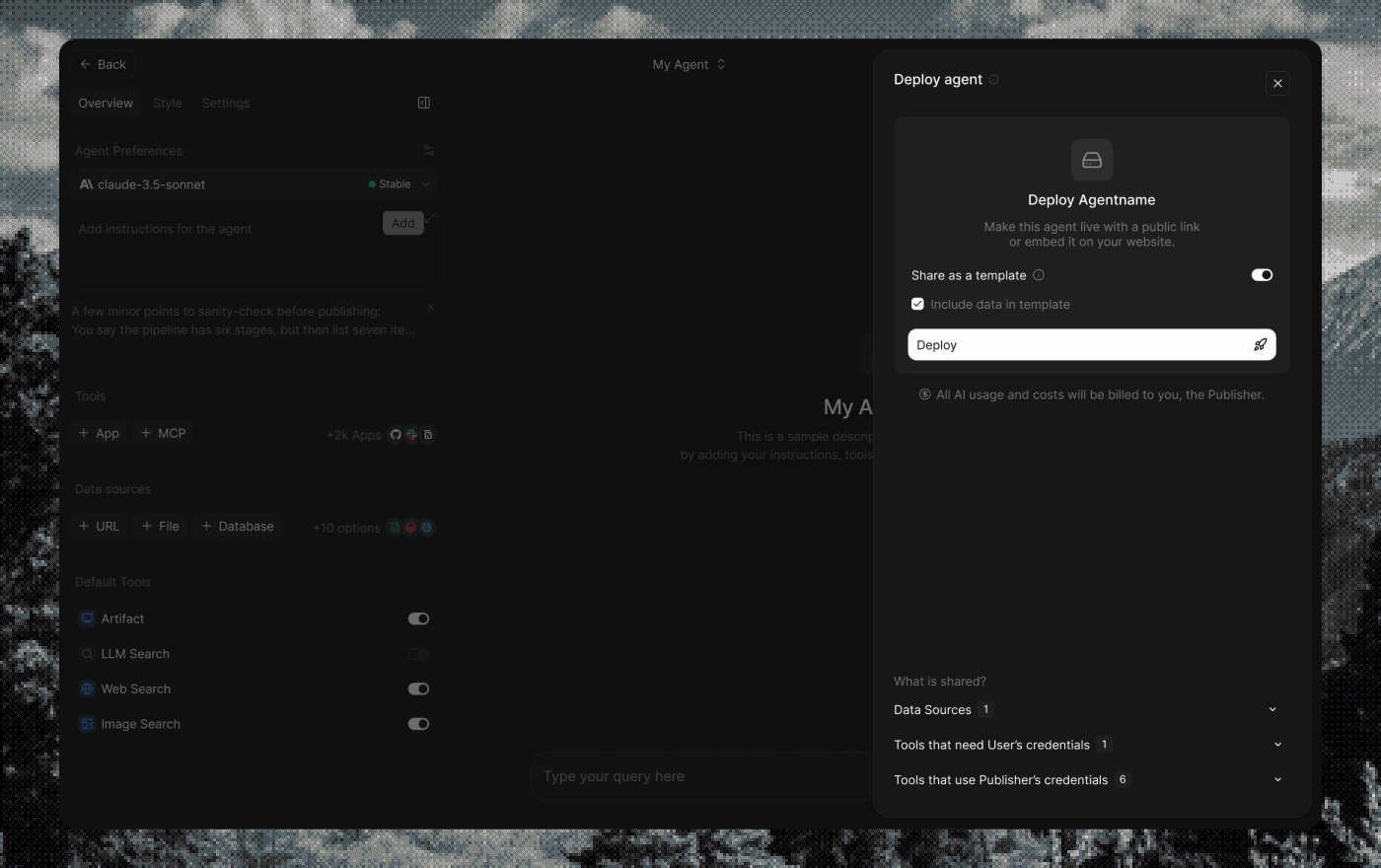
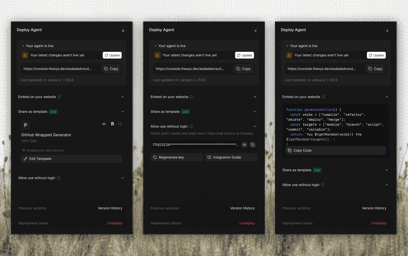
Deploy is the payoff. You publish your agent, share a link, or embed it in your product.
Deploy rates started low. The old flow split attention across side actions like templating and embedding, so the main task (actually shipping) got lost.
I made it one straight line: build, deploy, distribute. The extras moved off the path.
Deploy rates climbed from 11.1% to 15.5% within a month, and monthly deploys went from 432 to 2,934 in two.
Home
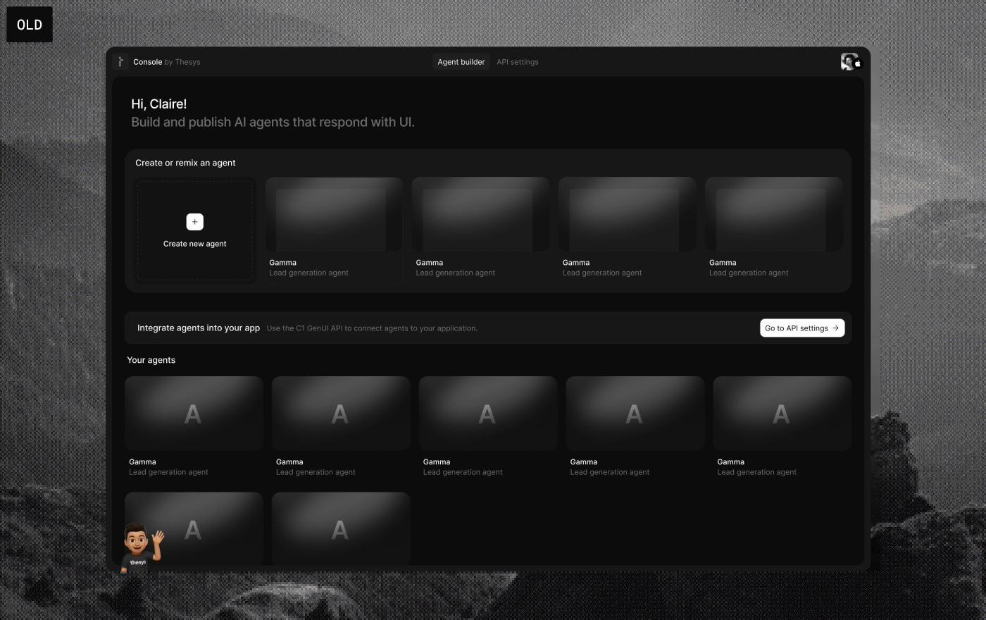
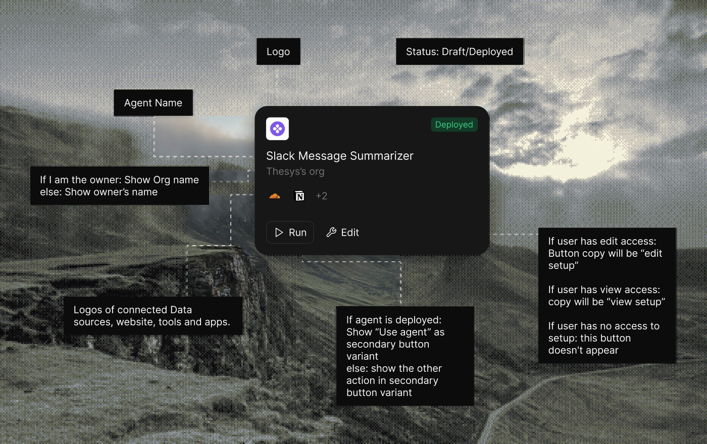
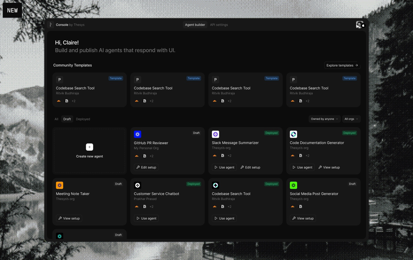
The old home cards carried almost no information. I rebuilt them around one idea: at a glance, you should know what you're looking at.
The goal was to leave more cues in the card:
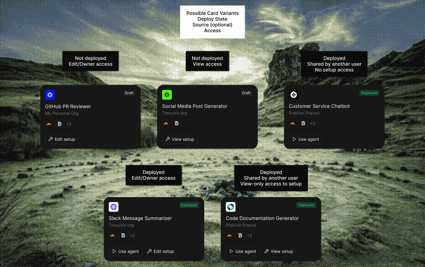
- which org it's from, and whether that's personal or work
- whether you own it or someone else does
- what tools and data are connected
- whether it's deployed or not
That last one sets the action. If it's not deployed, you edit it. If it is, you use it. Home isn't only where you ship agents for other people. It's also where you use the ones you built for yourself.
Marketing website
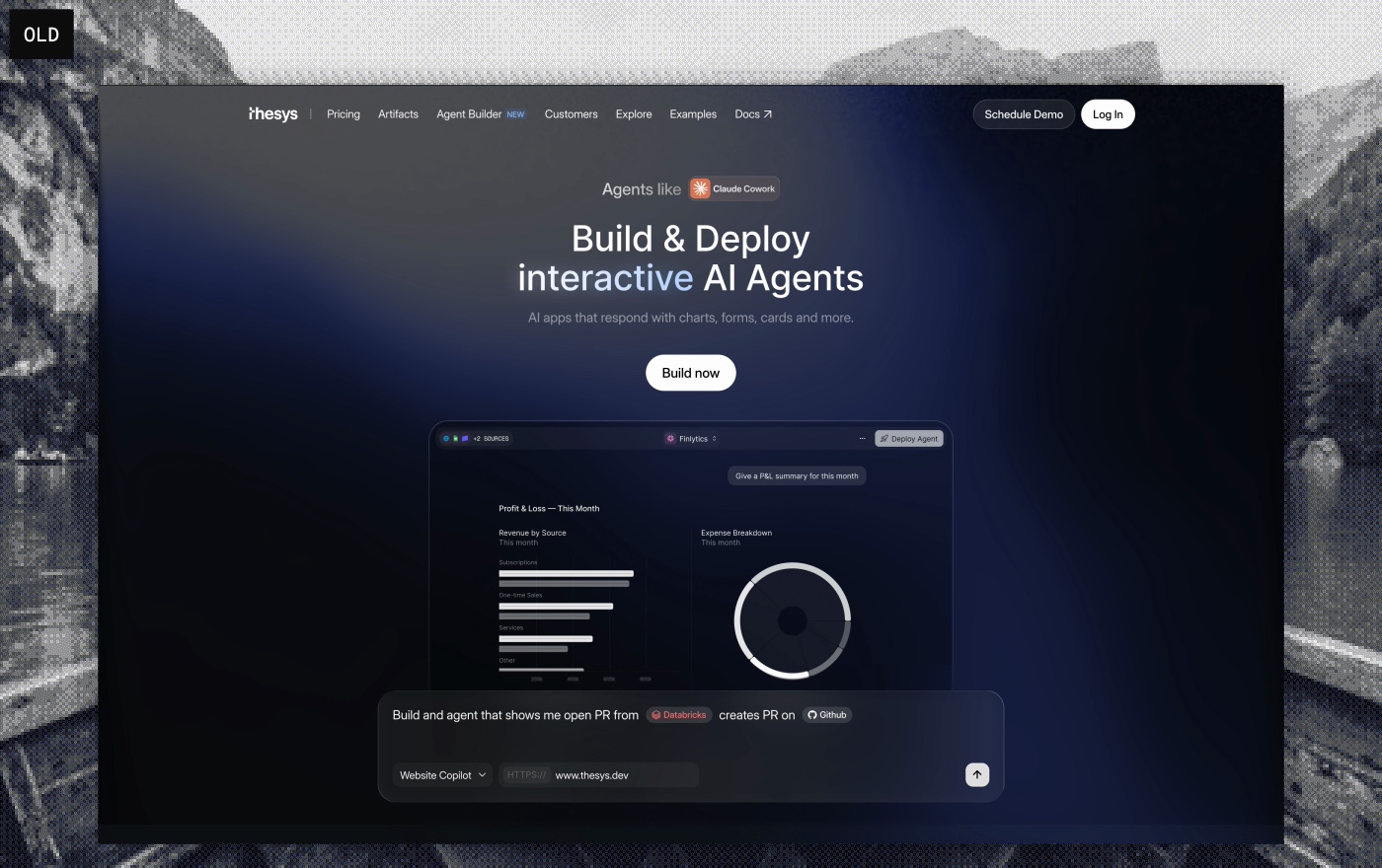
I designed the Agent Builder marketing page twice.
The first was my own design, and it carried a lot of our own biases. It did well for a while with a few tweaks, then it started sliding: conversion fell from 10–12% at launch to 3%, then 1.7%.
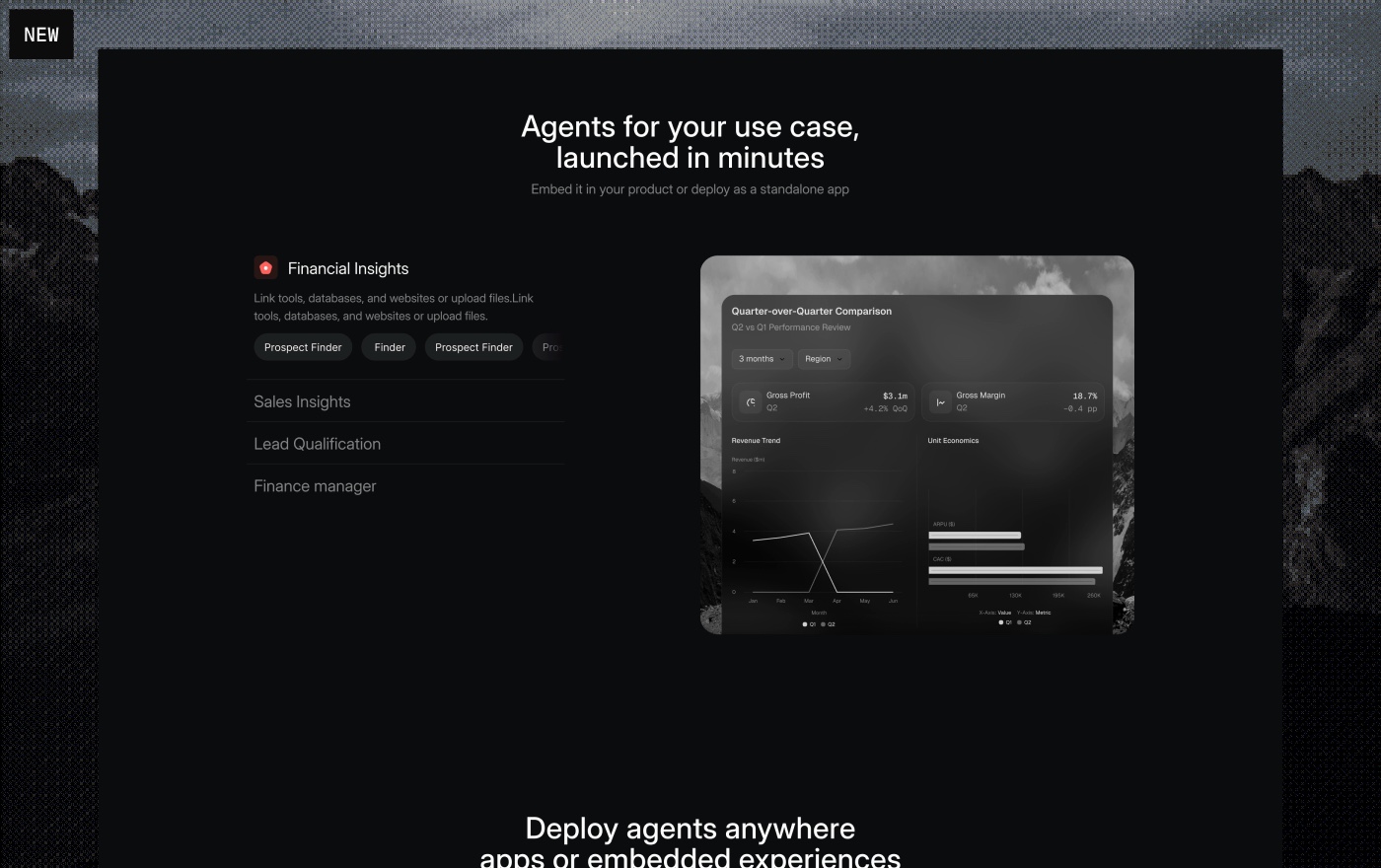
So I rebuilt the whole page in one pass. I designed it, built it, and shipped it myself. I looked at the competitors and found our real edge: our agents are the most usable and the best looking, and they make the most sense. So the site says exactly that, to one primary audience: data analytics teams.
- Open by showing how easy it is, and what the responses actually look like.
- Make the database support obvious: every source they already use.
- Show their use case fast, so they see themselves in it.
- Feature real community templates, with real names and faces, so the proof feels human.
Conversion climbed from 1.7% back to 14.8% the month after the rebuild, peaking at 17.8%: a 10.5× lift in funnel efficiency, past the industry average. Traffic compounded too: 12,362 → 26,837 unique visitors in two months.
Launch videos
When we launched Agent Builder, I made the launch video from start to finish: a person speaking, audio, UI motion, all of it. Solo. I did the rest of the launch assets the same way.
There's a lot more of Agent Builder than fits here: a usage dashboard, and plenty of other pieces I didn't get time to document. If you want the full picture, let's talk.
Schedule a call